Parks Canada App Design
App Design
This project involved creating an app mockup using Google Material Design standards that would help Canadian campers by improving the convenience of camping with Parks Canada.
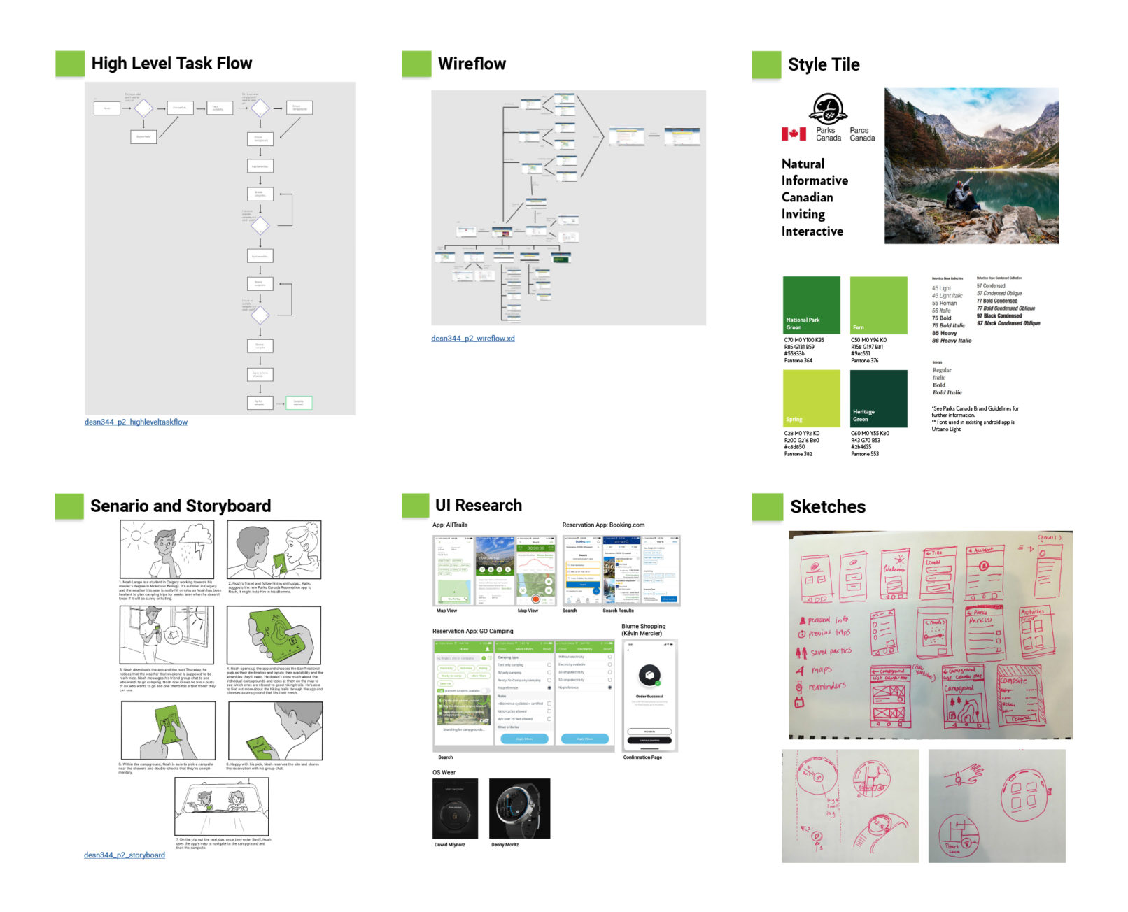
To start this project, I analyzed the existing website. The goal was to create an app that would serve the same purpose as the website but be easier to use both through improving the layout, increased portability, and adding additional features. I interviewed a user, created a high-level task flow, created a wireflow of the existing site, analyzed the existing Parks Canada branding, and created a scenario and storyboard.
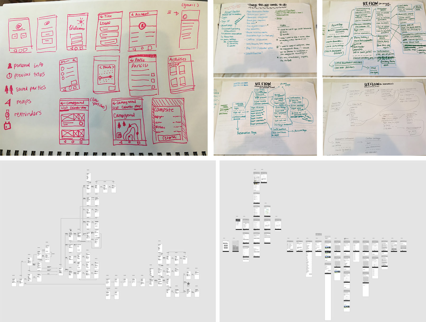
After coming to an understanding of the site it was time to translate it into an app. This involved learning about Google’s Material Design, analyzing competitor apps, sketching ideas and ui flows, and then low and high fidelity wireframes. Once the prototype was built, I conducted user tests to help iterate on my initial design.
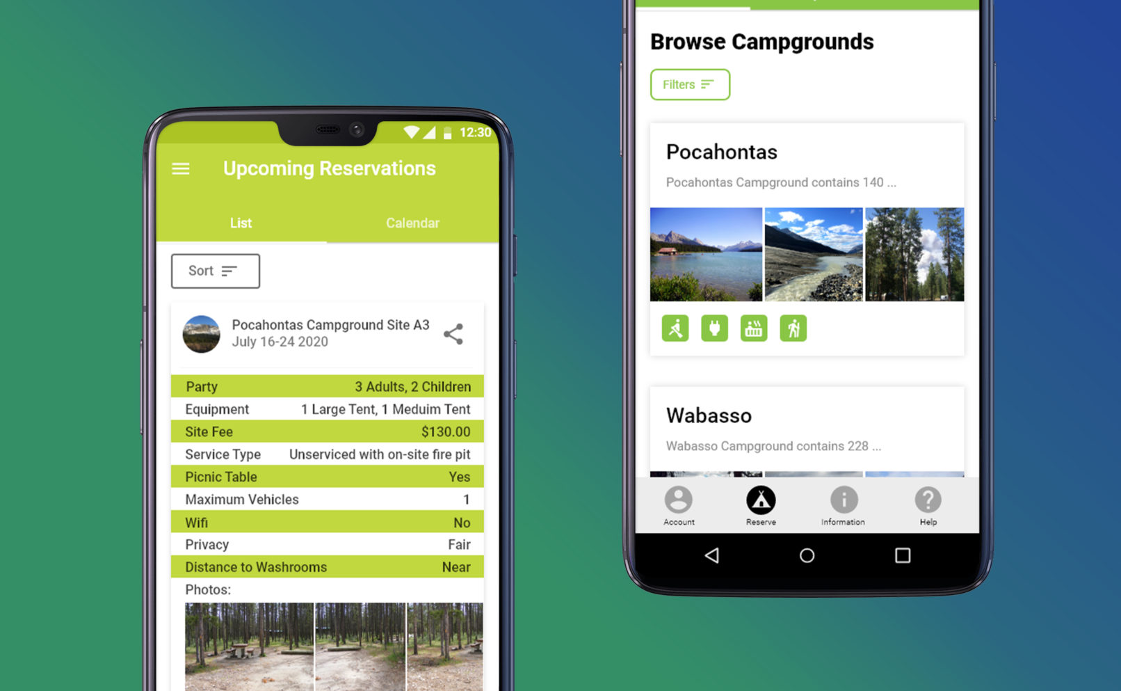
The final design allowed for campers to book their sites in a variety of ways and added features that improved usability such as reminders for upcoming reservations, in-app driving directions, and saved parties to expedite the booking process.
Video walkthrough:


